Skadoosh
Skadoosh
Operational UX
Kiosk Design
Currently Live

Designing for an impatient, excitable audience of kids and their parents.
Role
UX/UI Designer
Scope
Interface design,
prototyping
PLATFORM
Tablet App + Kiosk App
Type
0 → 1 product design,
operational UX
The Problem & Context
The Problem & Context
Skadoosh is an indoor play destination for kids of all ages. With two centres in operation, and increasing customers, managing operations was getting tough.
Skadoosh is an indoor play destination for kids of all ages. With two centres in operation, and increasing customers, managing operations was getting tough.

Checking and out of activities was done manually.
Checking and out of activities was done manually.
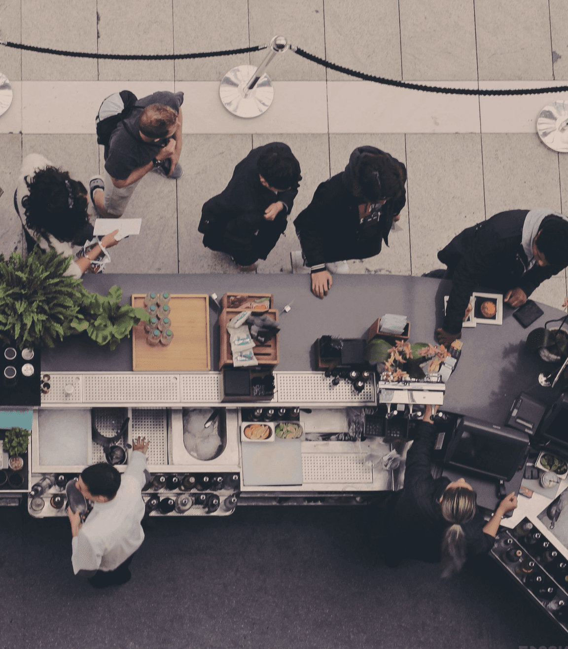
Keeping track of data manually was tough, especially across multiple venues,
Keeping track of data manually was tough, especially across multiple venues,
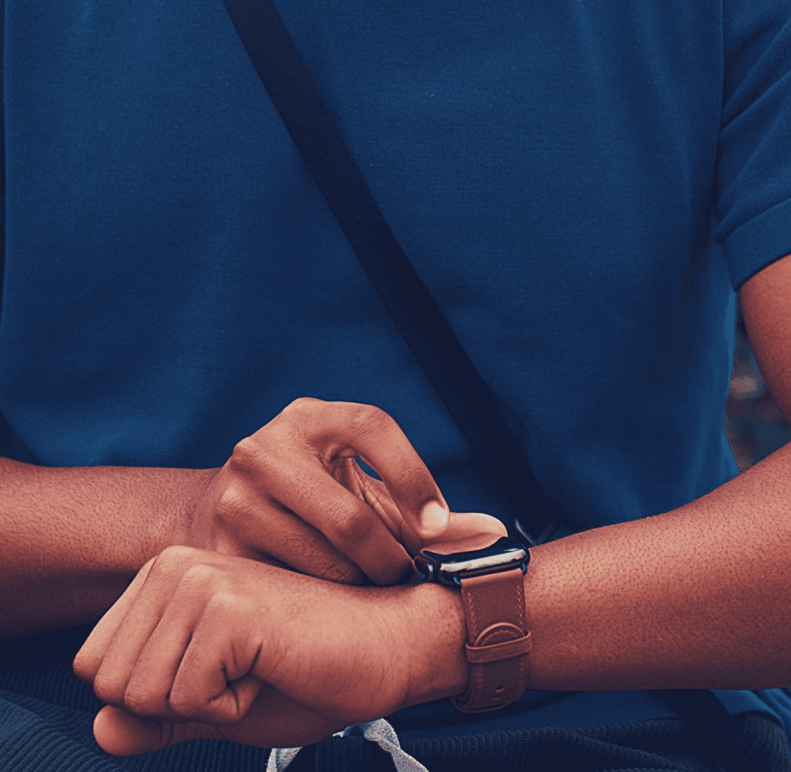
Operations were slow, and queues built up at the reception.
Operations were slow, and queues built up at the reception.
The Solution
The Solution
The Solution
We built an app to help:
We built an app to help:
Help staff manage operations better
Help staff manage operations better
Help staff manage operations better
Make the venue experience frictionless for distracted parents and impatient kids.
Make the venue experience frictionless for distracted parents and impatient kids.
Make the venue experience frictionless for distracted parents and impatient kids.
Scope, Discovery & Direction
Scope, Discovery & Direction
My Role
My Role
User Flows
User Flows
Branding
Branding
Interface
Interface
What is currently being used?
What is currently being used?
What is currently being used?
Manual receptions desks and spreadsheets were used to track customers, but that was slow, could lead to potential user errors, and was not a scalable solution.
Manual receptions desks and spreadsheets were used to track customers, but that was slow, could lead to potential user errors, and was not a scalable solution.

Insights &
Direction
Insights & Direction
Insights & Direction
The client wanted a platform that was:
The client wanted a platform that was:
Easy for parents to use
Efficient for admin to navigate
Scalable for future locations
Attractive to children
The product was built for two main user types
Built for two main user types
Built for Two Main User Types

Parents
People who want to start looking after themselves and their well-being again.

Children
Couples who want to improve their relationship, and find love in each other again.
Visual Language
Fun
Creative
Playful
The product was build for a physical play area for children, aimed at reducing their screen time, and stimulating their minds with interactive activities.
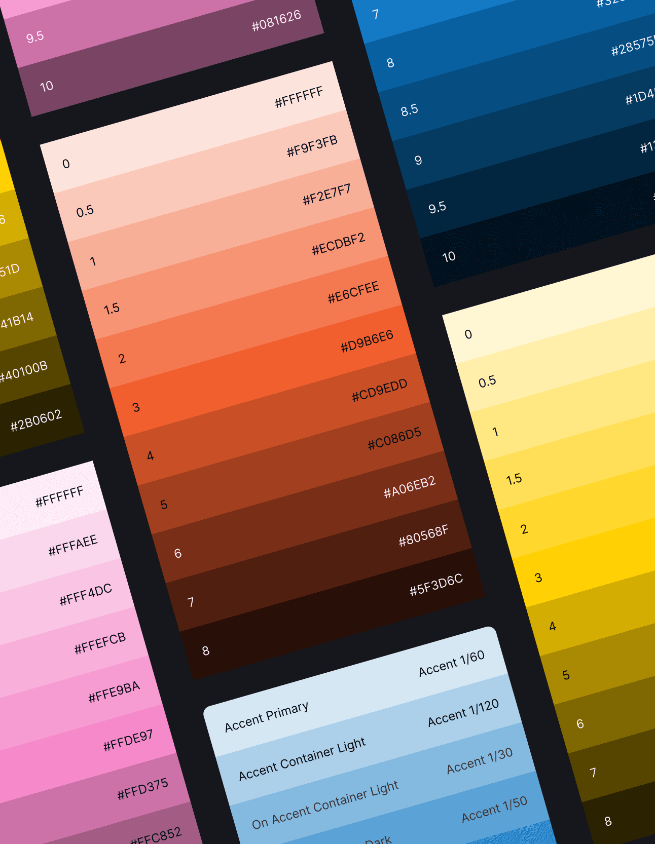
The colour palette was created based on the base branding document. The extended palette was build with colours that were bright, but not gaudy, and not excessively pastel.
Hi-fidelity Designs
Opening Screen
The very first screens children and their parents see when using the kiosk/tablet.


Choosing a Destination
The user can choose to browse through activities available at that location, learn about birthday bookings, and purchase/top up their game card.
Registration
An intuitive registration form, with quick choices for top ups, and prices for each activity listed clearly - giving the user everything they need to make their purchase on one screen.


Purchasing a
Game Card
A simple, scannable graphic demonstrating the process of purchasing and topping up a game card.
Quick Enquiries
An enquiry form that is take only the required information, and is simple to fill.


The Story Behind
the Feature
The Story Behind
the Feature
This was my first time designing a product that was going to be used in a large, physical space!
A notable difference I came to learn in the process of designing this is that the size and placement and layout of the elements on a kiosk screen differ greatly from a laptop or desktop.
While the actual available space on a kiosk screen is far larger than a laptop, people tend to stand further away, are usually impatient, and use their fingers to navigate.
In simple terms, this meant that every element of the design needed to be bigger, easily readable, and forgiving to imprecise finger navigation.
This was my first time designing a product that was going to be used in a large, physical space!
A notable difference I came to learn in the process of designing this is that the size and placement and layout of the elements on a kiosk screen differ greatly from a laptop or desktop.
While the actual available space on a kiosk screen is far larger than a laptop, people tend to stand further away, are usually impatient, and use their fingers to navigate.
In simple terms, this meant that every element of the design needed to be bigger, easily readable, and forgiving to imprecise finger navigation.

Credits
Credits
The work displayed here is the intellectual property of Skadoosh and Nitesh Yadav, and is presented for portfolio purposes only. I retain no ownership rights to this work.
The work displayed here is the intellectual property of Skadoosh and Nitesh Yadav, and is presented for portfolio purposes only. I retain no ownership rights to this work.
The work displayed here is the intellectual property of Skadoosh and Nitesh Yadav, and is presented for portfolio purposes only. I retain no ownership rights to this work.
This project was completed in collaboration with Shreyans Joshi and Pravin Suthar, two absolutely brilliant Product and Tech minds respectively.
This project was completed in collaboration with Shreyans Joshi and Pravin Suthar, two absolutely brilliant Product and Tech minds respectively.
This project was completed in collaboration with Shreyans Joshi and Pravin Suthar, two absolutely brilliant Product and Tech minds respectively.

Althea D’Silva
Product Designer
Product ideas can be complex. I translate them into designs that are simple to understand, and frictionless to use.
LETS WORK TOGETHER!

Powered by curiosi(tea)
And a good cup of chai.
Althea D’Silva
Product Designer
Product ideas can be complex. I translate them into designs that are simple to understand, and frictionless to use.
LETS WORK TOGETHER!
Powered by curiosi(tea)
And a good cup of chai.
Althea D’Silva
Product Designer
Product ideas can be complex. I translate them into designs that are simple to understand, and frictionless to use.
LETS WORK TOGETHER!
Powered by curiosi(tea)
And a good cup of chai.
Designing for the most impatient audience - parents with excited kids.
Designing for the most impatient audience - parents with excited kids.
Role
UX/UI Designer
Scope
Interface Design, Prototyping
PLATFORM
Tablet App + Kiosk App
Type
0 → 1 product design,
operational UX
Visual Language
Fun
Creative
Playful
The product was build for a physical play area for children, aimed at reducing their screen time, and stimulating their minds with interactive activities.
The colour palette was created based on the base branding document. The extended palette was build with colours that were bright, but not gaudy, and not excessively pastel.
Hi-fidelity Designs
Opening Screen
The very first screens children and their parents see when using the kiosk/tablet.
Choosing a Destination
The user can choose to browse through activities available at that location, learn about birthday bookings, and purchase/top up their game card.
Registration
An intuitive registration form, with quick choices for top ups, and prices for each activity listed clearly - giving the user everything they need to make their purchase on one screen.
Purchasing a Game Card
A simple, scannable graphic demonstrating the process of purchasing and topping up a game card.
Quick Enquiries
An enquiry form that is take only the required information, and is simple to fill.
Visual Language
Fun
Creative
Playful
The product was build for a physical play area for children, aimed at reducing their screen time, and stimulating their minds with interactive activities.
The colour palette was created based on the base branding document. The extended palette was build with colours that were bright, but not gaudy, and not excessively pastel.
Hi-fidelity Designs
Opening Screen
The very first screens children and their parents see when using the kiosk/tablet.
Chooding a Destination
The user can choose to browse through activities available at that location, learn about birthday bookings, and purchase/top up their game card.
Registration
An intuitive registration form, with quick choices for top ups, and prices for each activity listed clearly - giving the user everything they need to make their purchase on one screen.
Purchasing a Game Card
A simple, scannable graphic demonstrating the process of purchasing and topping up a game card.
Quick Enquiries
An enquiry form that is take only the required information, and is simple to fill.